Jessica Emerson

VIST375 blog

Assignment 10: Rewrite an Assignment

Image

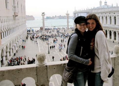
This photo was taken in Saint Mark’s Square in Venice, Italy during the fall of 2011. We were standing next to the bronze replicas of the four Greek Horses located in Saint Mark’s Museum, just inside the basilica. There are several composition concepts displayed in this image to help direct the viewer’s eye. Unity, value, emphasis, and balance are some concepts used to analyze this photograph.

Unity suggests that elements of a composition appear to belong together or relate to each other. In other words, two individual objects appear as one. Several examples of unity exist in the composition: Ashlynn and I are seen as one single unit instead of two people, the circles of static tourists standing below us form a unit, and the line of gondolas floating in the water appear to be a single unit of multiple similar objects.

Contrast in value helps with depth perception because areas of greater contrast appear to advance in the foreground, while areas of lesser contrast appear to recede into the background. It is very easy to establish a foreground and background in this photograph because of the contrast in value. Ashlynn and I have a much higher contrast in the foreground, while the water and buildings in the distance hardly have any contrast at all.

Emphasis is used in a composition to direct the viewer’s eye toward the focal point. More specifically, emphasis through perspective is used to direct the eye toward the group of buildings in the distance that represent the focal point of this photograph. There is also emphasis through recognition because human characters naturally attract the viewer’s eye in order to understand the composition. The face and eyes of a human character can help the viewer make sense of what is going on because they are recognizable objects that carry meaning.

Points of emphasis carry visual weight and contribute to the balance of an image. This image successfully represents asymmetrical balance, which can occur across both the horizontal and vertical axes. More specifically, it shows balance by line direction because the edges of surrounding buildings turn the focus from the heavier side, represented by Ashlynn and I, to the lighter side represented by open water and a clear sky.

Composition concepts play a big role when analyzing a photograph. In this case, unity, value, emphasis, and balance contribute to the overall composition and help evaluate the effectiveness of the image.
Assignment 9: Visualization Topic

Motion graphics have caught my attention more than any other element in Visualization through the last couple of years. Although I do enjoy static graphics such as posters, brochures, advertisements, etc, the use of kinetics tends to catch my attention so much more. A person can really strengthen a piece by making an object “come alive,” especially an object that isn’t meant to move in the real world; this opens up our minds to infinite possibilities.

More specifically, I have a deep appreciation for successful kinetic typography. I am very distracted by beautiful typefaces, so the use of motion can tremendously enhance a project aesthetically. On the other hand, I’ve seen it really hurt projects, which is why I emphasize successful kinetic typography. It is a powerful element in Visualization where I hope to gain more experience. They can determine first impressions, there are no limitations, and they remind us to think before we speak.

In my opinion, the best examples of kinetic typography are movie title sequences at the beginning of a movie. A viewer’s first impression tends to be based off this part of the movie because it acts as an introduction to the film. A terrible film that has good introductory kinetic typography at least gives the viewer a positive mindset for what comes next. This same idea works for companies that have kinetic typography in their logo to help advertising. That specific company may not be a good company to work for, but successful kinetics can give them a positive attitude toward the company and what it represents.

My favorite part about typography is that there aren’t limitations. There are thousands of typefaces available to download on the Internet. If all else fails, make up your own! I personally enjoy making my own handwritten, ornate fonts and transferring them into the computer to animate. Either way, the options are endless.

Lastly, kinetic typography provides a visual element to the way we speak to each other. I had the privilege of taking a one-minute conversation from a movie of my choice and adding kinetic type so that the viewer can read as it plays. I chose an extremely powerful clip from “Remember the Titans,” where I emphasized the racial views between a black football player and a white football player. When we can visually see the way words come across, it makes us take a step back and think about what we are saying. Words are more powerful than we think, and they can break a person down just as fast as it can lift someone up.

Assignment 8: Short Sequence Analysis

Image

Image

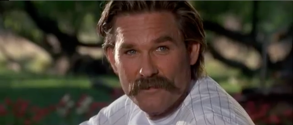
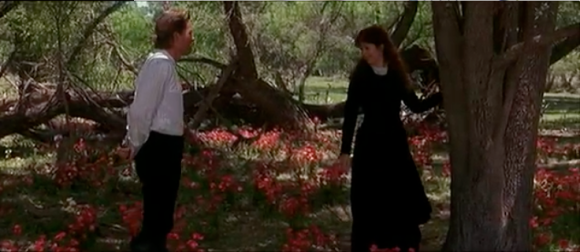
Tombstone is a classic American western movie made in 1993 that is based on events that occurred in the 1880’s. For this assignment, I’ve chosen to analyze a scene when Wyatt Earp (Kurt Russell) and Josephine Marcus (Dana Delaney) first meet on their horses. They are the center of the love story among all the violence in the movie and I really enjoy the scene in the woods where they talk about their dreams in life. I will analyze this sequence of dialogue with action by addressing camera movement, distances, editing concepts, time compression, and shot matching.

Although the camera appears to be static during the close up dialogue between Wyatt and Josephine, it is actually making subtle movements. When Josephine is speaking, the camera tilts as she raises or hangs her head, making a pivoting motion up and down. From the master shot, the camera pans to the right as both characters move to the right, creating fluid movement in the sequence.

Only three distances between the camera and action are used for this sequence: full close-up, wide close-up, and full shot. The shorter takes of dialogue switch back and forth between full and wide distances. More specifically, the camera tends to keep the base of the frame between the collarbone and right below the shoulders. The full shot is used as Wyatt and Josephine move to the right of the scene.

A scene may be edited in three different ways, but this sequence only uses one of the methods: a master shot of both Wyatt and Josephine is intercut with shorter takes of them individually speaking to each other. Two persons are separately observed by the camera to form the dialogue in the scene, which represents one of two types of parallel editing. It is essential to use time compression for clips of dialogue so that the real elapsed time isn’t dragging the scene on longer than necessary.

Shot matching has three requirements that must be satisfied in order to produce a strong sequence: the position, the movement, and the look. Wyatt and Josephine remain on the same side of the screen until the middle of the dialogue when they switch sides. This works in this particular situation because the movement and look is very strong. Throughout the dialogue, both characters subtly move right as the camera pans to the right, allowing the viewer’s eyes to follow comfortably. Even with this movement, the look between Wyatt and Josephine is accurate; there is never a question that this scene is strictly between them, which makes the scene very charming and intimate. For this reason, I find the sequence extremely effective.

Assignent 7: 3D Modeling

Although I don’t have much experience in 3D modeling, I am extremely proud of one animation I completed last spring semester in my 305 studio with Mary Saslow. The main character was a sunflower that physically and emotionally reacted to the change in weather. The petals and leaves were the main parts of the flower that spoke to the viewer because they mimicked a human being’s ears and arms, respectively. Each part of the sunflower was modeled separately from then parented or linked somehow. I designed a fairly easy model that was assembled from simple 3D shapes or extruding planes, then manipulated using parametric surfaces.

First, I began with a square plane for the base of the flower pot. I extruded the entire plane just enough to give the pot a thickness, then extruded the outside four-by-four subarray of control values to form the walls of the pot. The same technique was used for the stem, which started as a cylinder and I extruded one end. I had to add multiple rows to the control points array in order to have some imperfection to the shape of the stem. After all, slightly altering objects that appear perfect makes for a more realistic animation.

The leaves were tricky. I didn’t want them to be too flat or too thick and they needed to be extremely easy to animate because they show a lot of the flower’s emotion throughout the animation, similar to the way our hands speak for us. The hardest part was keeping rectangular shaped “patches” on the surface, or four-by-four subarrays of control points, because I had to make a cylinder shape come off the leaf to connect to the stem. Connecting a square and circle is challenging for a first-time animator. When using parametric surfaces, a disadvantage is that the rows and columns must be completely wrapped around the object so that there is continuity on the surface.

The center part of the flower head was a regular sphere that I warped to make thinner. Each petal was formed by manipulating a rectangular plane into a round shape then extruding it to give it a very thin depth. I basically copied and pasted this shape so that it repeated around the flower head. The same technique was used for the cluster of leaves on the back of the sunflower head. After repeating the shape, I combined some control points from the stem with some of the leaves to make the surface appear smoother.

Assignment 6: Composition Concepts

Image

This photo was taken of Ashlynn Snelling and myself in Saint Mark’s Square in Venice, Italy during the fall of 2011. We were standing next to the bronze replicas of the four Greek Horses located in Saint Mark’s Museum inside the basilica. There are several composition concepts displayed in this image to help direct the viewer’s eye. Unity, value, emphasis, and balance are some concepts that I will break down in order to analyze this photograph.

Unity suggests that elements of a composition appear to belong together or relate to each other; it means looking at them as a whole instead of individual objects. Several examples of unity exist in the composition. Ashlynn and I are seen as one single unit instead of two people, and the circles of static tourists standing below us form a group, or single unit. Also, the line of gondolas floating in the water does not appear to be multiple objects, but a group of similar objects that are close to each other and therefore appear as one.

Contrast in value helps with depth perception because areas of greater contrast appear to advance in the foreground, while areas of lesser contrast appear to recede into the background. It is very easy to establish a foreground and background in this photograph because of the contrast in value. Ashlynn and I have a much higher contrast in the foreground, while the water and buildings in the distance hardly have any contrast at all.

In general, emphasis is used in a composition to direct the viewer’s eye toward the focal point. More specifically, emphasis through perspective is used to direct the eye toward the group of buildings in the distance that represent the focal point of this photograph. There is also emphasis through recognition because human characters naturally attract the viewer’s eye in order to understand the composition. The face and eyes of a human character can help the viewer make sense of what is going on because they are recognizable objects that carry meaning.

Points of emphasis carry visual weight and contribute to the balance of an image. This image successfully represents asymmetrical balance, which can occur across both the horizontal and vertical axes. More specifically, it shows balance by line direction because the edges of surrounding buildings turn the focus from the heavier side, represented by Ashlynn and I, to the lighter side represented by open water and a clear sky.

Composition concepts play a big role when analyzing a photograph. In this case, unity, value, emphasis, and balance contribute to the overall composition and help evaluate the effectiveness of the image.

Assignment 5: redo Assignment 1

Above is a picture of my recent trip to New York City. I am standing in the middle of Times Square, a major commercial intersection that’s one of the highest visited tourist attractions in the world. I’m surrounded by thousands of fast-paced pedestrians, a few street vendors attempting to deliver a sales pitch, and some of the most impressive graphics I’ve ever witnessed. Although this was taken for another assignment, I feel that it successfully represents me for several reasons. This photograph displays my present fear of moving out of my comfort zone, my future dreams of being exposed to outstanding advertising, and the constant desire to travel.

Most of my life I have lived in the country, where I had to take a few back roads before I hit the dirt road leading to my house. My neighbors were a few cornfields away and we worried about keeping peacocks out of our front yard, not the neighbor’s music being too loud. My point is that big cities are not something I am accustomed to and it intimidates me to think about living in a place as big as New York City. I remember feeling really overwhelmed by all of the people and cars surrounding me. The constant sound of car horns is quite an adjustment from the sound of crickets chirping. Although I am fully aware that in time I will adapt to such an environment, I still have fears about being unhappy or unsafe in the meantime.

Along with fear, this picture represents the excitement I feel when I think about the amount of opportunity in NYC. I know that some day I will be successful in the design world, but it takes being exposed to the best advertising and pushing my comfort zone to accomplish my dream. Times Square is a perfect display of high-end advertising around the world. New York City provides endless opportunity and I look forward to the day that I get an internship or job with a large firm so that I can challenge myself and develop into an inspiring designer.

This particular picture most importantly represents my desire to travel the world, a dream that started when I studied abroad in the Fall of 2011. I learned to appreciate other cultures and to put myself in their shoes for a change. It’s really important to me that I stay open-minded, regardless if I was raised in a country town of only 4,000 people. Traveling is one way to grow as an individual because you are constantly experiencing new things on your adventures. New York City is a mixture of all cultures around the world and I remember thinking to myself, “This is the closest I’ve felt to Europe since I left a year ago.” Racing through traffic on that bike took me back to my near death taxi rides in Rome, Italy. I am hopeful that NYC will provide me with connections I never imagined to continue traveling for several years.

Assignment 4: Image Manipulation

When it comes to manipulating a digital image, the possibilities are endless.  Adobe Photoshop has allowed me to manipulate a black and white picture taken in Cinque Terre, Italy in the Fall of 2011. Through the use of point operations and neighborhood operations, I managed to give the photograph a completely different look.

Point operations can either be unary or binary. In this case, I used unary point operations because I am dealing with a single image as opposed to combining two images to make a resulting image. More specifically, numeric transformations are useful unary point operations that are applied to each pixel in the input image. Two different numeric transformations were used to manipulate the original image: contrast function and image threshold function, respectively.

First, I chose to increase the contrast to 100% because there were too many middle tones in the photograph. Applying the contrast function made dark areas of the input image even darker while the bright areas became brighter. To be more specific, lower intensity values are mapped to 0 while high intensity values are mapped to the maximum value of 255. The values in between are distributed in between 0 and 255.

Next, I applied the image threshold function to the input image. However, I did not increase or decrease the threshold level once turned on. The strong light source and the reflection on the surface of the water created a nice balance of dark and light color so I left the slider in the middle at 128. Consequently, all input values below the threshold value of 128 are set to the minimum value of 0, making them black. On the other hand, the input values above 128 will be set to the maximum value of 255, making them white. Taking out the gray tones in the image gave it a sharp, harsh feel and really brought attention to the rocks. The memories in the photograph revolved around cliff jumping, so I wanted the cliffs and myself to really jump out at the viewer.

After applying the point operations, I used a neighborhood operation, which combines information from a region of input image pixels in order to create each new output image pixel. Geometric transformations are just one class of neighborhood operations. By applying the geometric neighborhood transformation of image warping to my original image, I created a “fish-eye” view. I stretched each corner of the middle square outward to get this effect. Throughout our adventures in Italy, a friend of mine had a GoPro camera that she strapped to her wrist when we were cliff jumping. Later, we made a video of our experiences and they all had the fish-eye effect because of the device she used. The image warping reminds me of a still frame from the recorded memories in Cinque Terre, Italy.

Assignment #3: “Flag” by Jasper Johns

Image

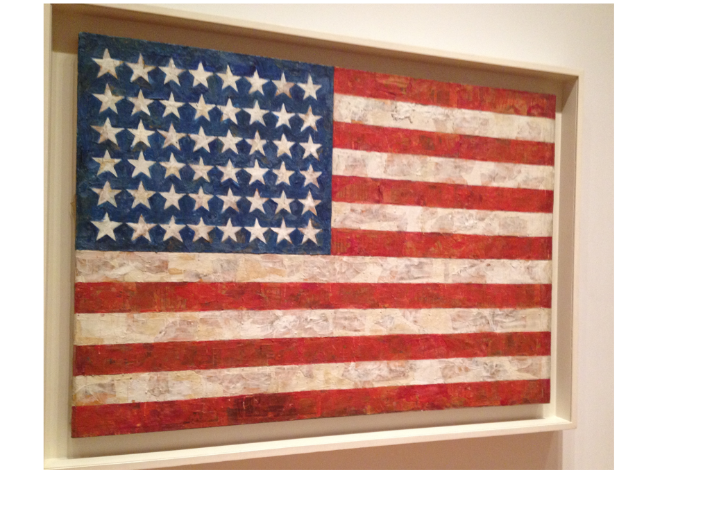
This is an image of an original painting named “Flag” by Jasper Johns. I recently visited the Museum of Modern Art in New York City and took this picture because the texturing up close was really impressive. From far away it looks like an ordinary American flag, but the layers of newspaper and encaustic paint he used to form lumps and smears caught my eye. I will analyze this image by breaking down the components of a sign, its denotative and connotative aspect, and its role as an image icon.

Every sign is composed of two parts: the signifier and the signified. A signifier is the sound, written word, or image; in this case the flag would be the signifier. The signified component is the concept evoked by that sound, written word, or image. The American flag evokes a feeling of Americanism, pride, and loyalty to the United States of America.

Another way to analyze an image is to break down the denotative and connotative aspects. Denotative refers the literal, descriptive meaning of an image. In this case it refers to a flag with six white stripes, seven red stripes, and 48 white stars on top of a blue rectangle, all made with plywood, strips of newspaper, and encaustic paint. Connotative meanings rely on its cultural context and what the image means to the viewers personally. This image represents my freedom and those who fight every day for our country, while for someone across the world it might represent their enemy. This image also carries artistic value for me personally because I am a Visualization student that’s surrounded by art every day. Referring to the connotative aspect, it serves as a reminder that there are no limits in art and that any materials can be used to create an inspiring piece of work.

An image icon is defined as something or someone that has great symbolic meaning for many people. Icons are often perceived to present universal concept, emotions, or meanings. I continuously think of September 11th every time I see an American flag and the impact it had on our country, but I also know that it’s something people relate to across the world. While studying in Italy during the fall of 2011, the town of Castiglion Fiorentino held a memorial service out of respect for the United States. The traumatic event is still so new in my mind that I automatically think of that day when I see American flags. Jasper Johns mentioned that the American flag is something “the mind already knows” because it is so easily remembered worldwide. As I mentioned before, it is an image icon representing Americanism, pride, and loyalty to the United States of America.


Sources:

“Practices of Looking” handout

http://www.moma.org/collection/object.php?object_id=78805

Assignment 2: Film-based vs Digital Photography

Film versus digital photography has been a growing debate over the years, with both sides having good points to the argument. While they both achieve the goal of capturing a moment in time, film-based photography is a better choice for many reasons. Digital photography may be faster, more convenient, and less expensive, but film-based photography represents a true passion for photography, the intimacy of an original hard copy, and the appreciation that is often lost in digital photography.

Before digital photography came about, there weren’t near as many people claiming to be photographers. It seems these days that everybody is a photographer because they can take a photo as many times as they’d like until it looks desirable, then edit the things that weren’t noticed at the time of the shot. This is the biggest concern when comparing the two; a photographer should take into account the place, the time, the lighting, how everything is arranged, etc., instead of relying on software to correct their mistakes. Impressive photography should depend solely on the person behind the camera, not the programs which can alter the scene.

For those that do not claim to be professional photographers but simply take pictures for fun, the same ideas apply. Although it’s more convenient to snap several hundred pictures and be able to view on a computer screen, there’s something much more intimate and special about a hard copy of a photo that couldn’t possibly be altered. It’s the truth behind the photograph that sets film-based photography apart from digital photography. Previous generations appear to cherish their photos, much like a keepsake to remind them of their childhood. Today there is easy access to computers, laptops, phones, and other digital devices that can easily record videos or snap photos, then create photo albums, blogs, or post to social websites. It has become so convenient to keep photographs on devices that the desire to print and hold a copy in hand has slowly faded.

Nobody can argue with the idea that the more time, thought, and energy a person puts into something, the more they are going to appreciate it. Digital photography may be faster and more convenient, but if the photographer is truly passionate about these moments they’re capturing or the art of photography, it’s important to consider whether or not time really matters. With that said, it seems that some appreciation is lost using digital devices because it is so easy to transfer data through electronics and media. In film photography there isn’t a screen to view the images, so there’s no way to know whether a picture is blurry or the lighting is off until it’s time to develop the film. It truly takes patience and appreciation of the art to be a film-based photographer.

Assignment 1

This is a picture from my recent trip to NYC, specifically standing in Times Square. It was originally taken for another assignment, where I was supposed to represent what “social” meant to me, but I feel that it represents me very well as a person too.

Times Square is an example of several things that appeal to me: opportunity for success, a variety of cultures, stepping out of my comfort zone, meeting new people and networking, advertising and design, adventure and traveling, etc. There’s room to grow rather quickly because you experience something new every day in a city as fast-paced as NYC.

This picture was taken during a bike ride through the city, in the middle of all the chaos. I will never forget the overwhelming feeling I got the first time I saw Times Square. I’ve been in a design related degree program for several years now and in this moment I felt like all my hard work was paying off. I felt like I had a chance to really be successful and be surrounded by the very best. The bilboards and screens lit up all hours of the day, showing the very latest in advertising, was a sign that NYC was where I needed to be to grow in the industry and really expose myself.

Without a challenge, it’s easy for someone to get comfortable where they are, which brings me to why I really love this picture: it’s a representation of my future. I’ve grown up in a town of no more than 4,000 people, living the country life for quite some time. I was raised to hunt, fish, love the outdoors, and be my dad’s best friend. If someone had asked me 10 years, maybe even 5 years ago, where I saw myself after college graduation, NYC would be the very last place. I know that after working there I will have more opportunities back in Texas, which is ultimately where I want to live again, but first I need to live a little 🙂

With that being said, I am an extremely open-minded person. It would be difficult for a person who is close minded to live in a city as diverse as NYC. I have a hunger to learn and experience EVERY possible thing I can, even the things I never imagined I would. It represents my passion to travel as well because there are so many things to see in New York and it’s closer to Europe which is where many of my dreams came true last fall. I plan on traveling the world for many years and NYC will hopefully provide me with connections I never imagined.